Photoshop
Dreamweaver
Concepting,
Building
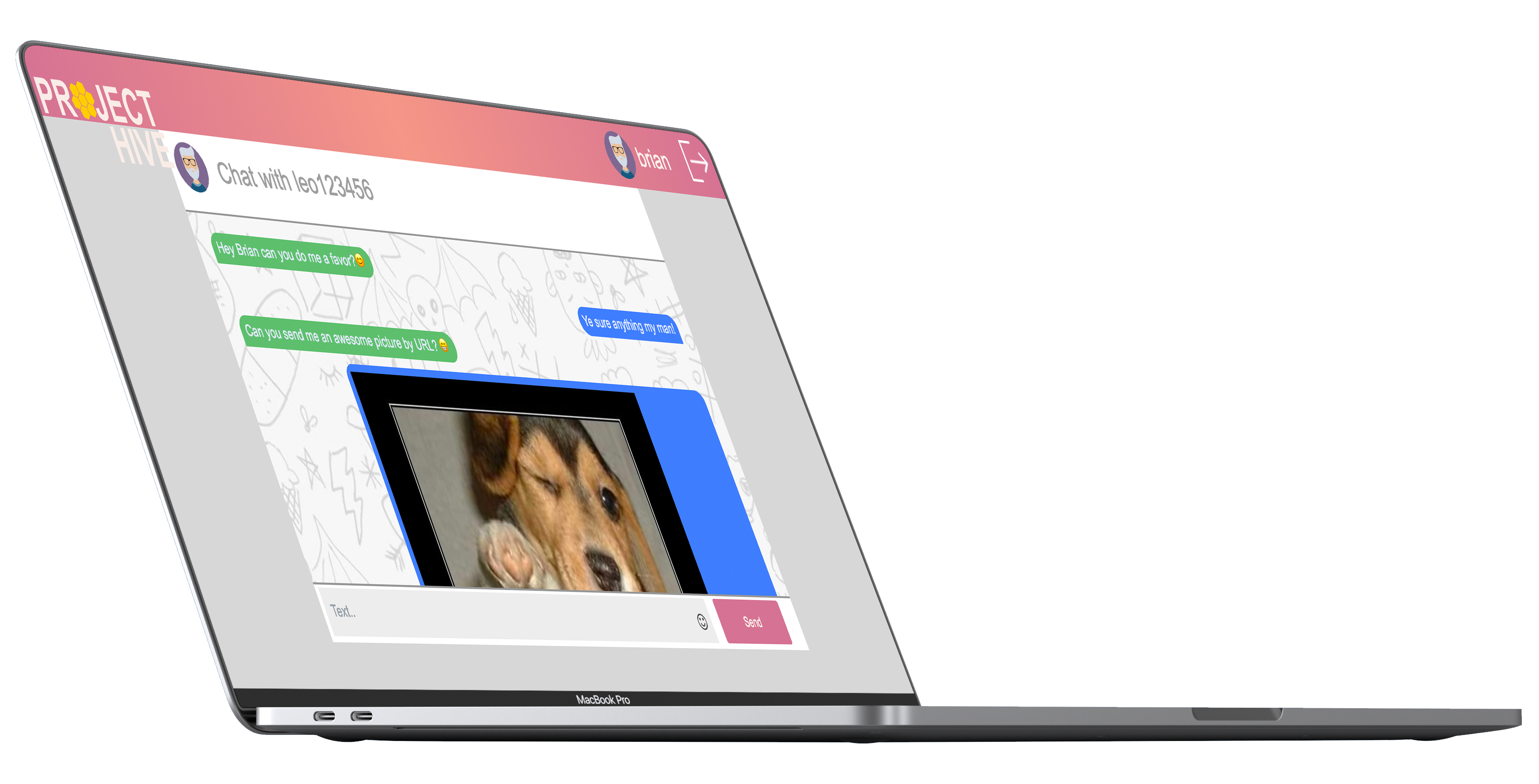
The idea behind Project Hive is to make a web chat that teams could use intern to communicate. The application had to be build in roughly 16 hours from the ground up, this includes UI / UX and all technical aspects. Project Hive the name comes from a beehive, "A beehive is an enclosed, man-made structure". Inside a beehive there's different bees working together to make a product, honey. This was a suiting name for a product that contains teamwork, communication and is inside an enclosed man-made environment.

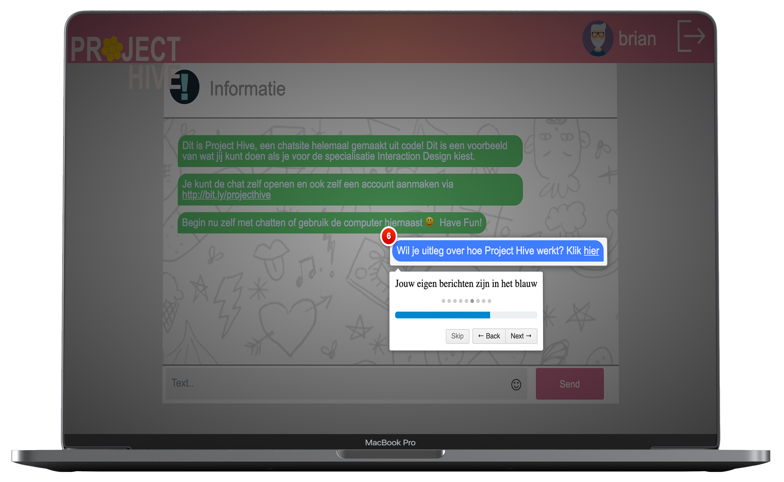
Tutorial
Because the application was shown in an open house it was smart to make a so called optional "tutorial". I know that when you have to make a tutorial, you already failed the UX part. However in the short period I had for this time I think it was the right approach to add this in so people could use it their selfs quickly and it could teach people a bit of the back history.

Rebranding
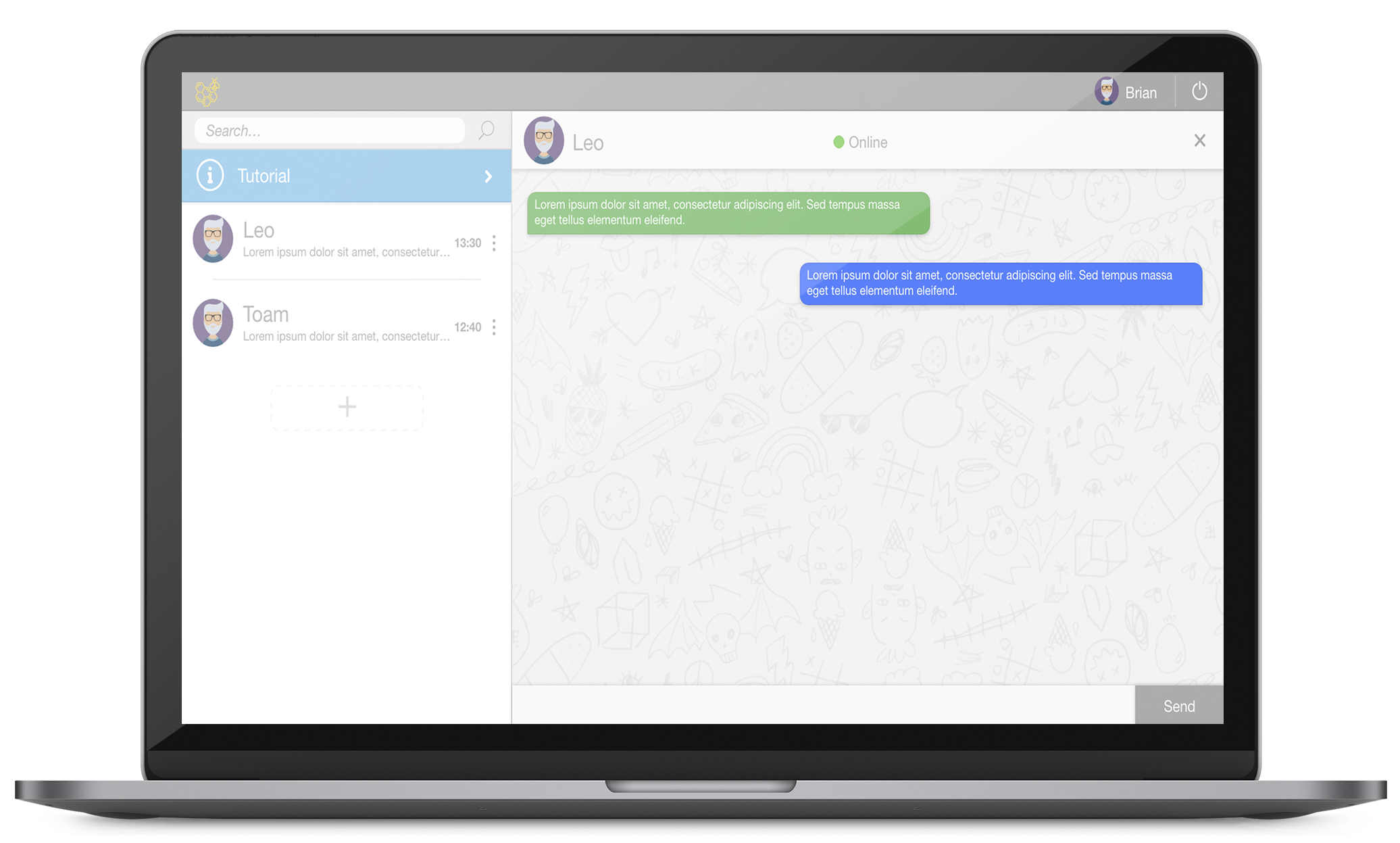
Now the MVP is standing with the technical part as main focus and after gathering user feedback from the open house it was smart to move on to the next part. Redesigning the UI and planning the future of the platform. The time between the first design and deployment and the second redesign period was almost a year. And I could cooperate most of the things I learned in the practice to this platform again. The changes are huge.

The Chat
It's important for a chat application that the users can quickly switch between different chats. In the first approach I quickly learned that this was very important, yet I didn't found a way to implement it back then. During the redesign process I found a better way to increase overall UX in the application and make it more user friendly.

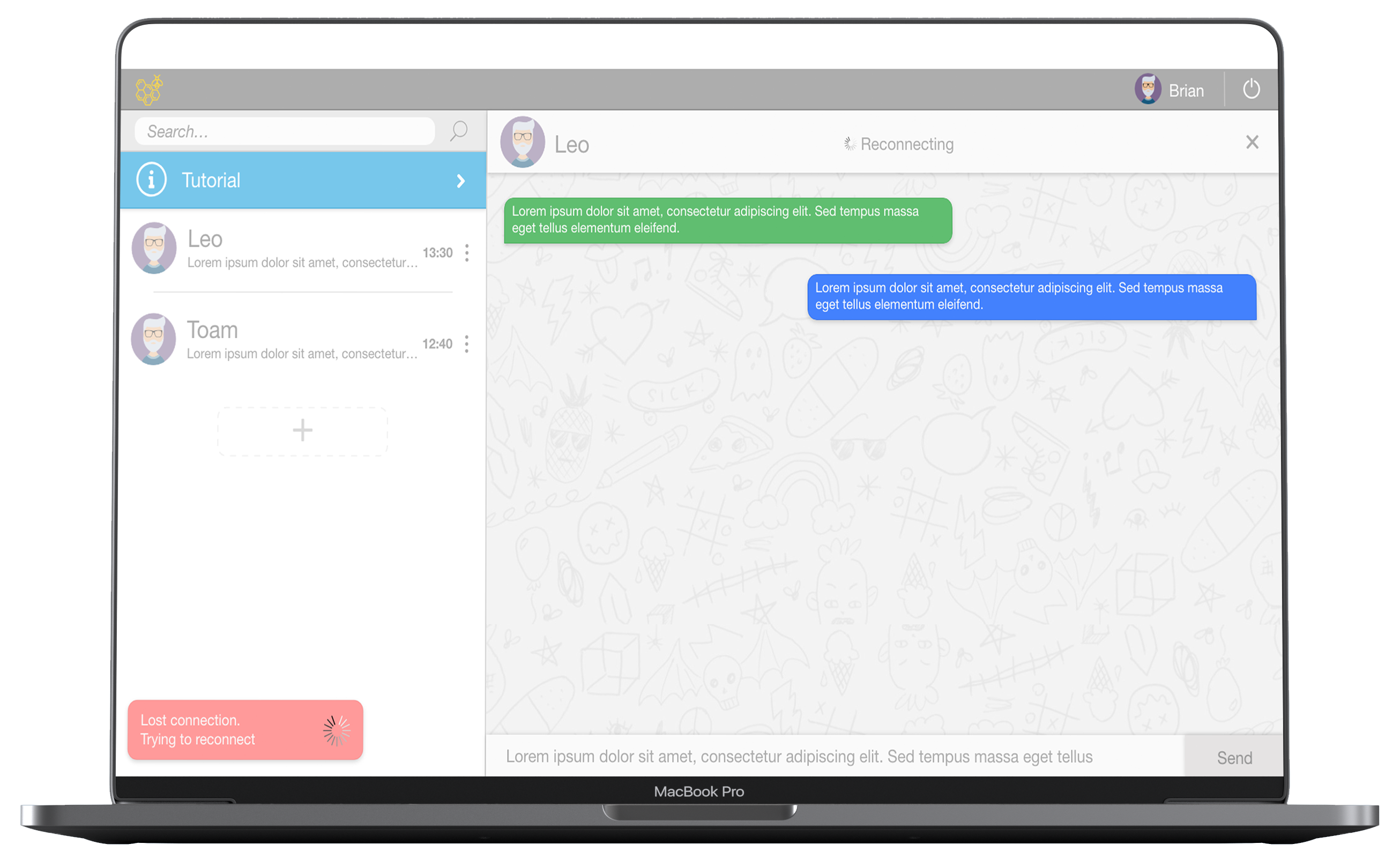
However the only feedback response before was a sound when you got a new message. But there's more ways of giving user feedback for an example a message that pops up when you lose internet connection. So during the redesign process I focussed on different types on user feedback in different scenarios.

Results
At this moment, the chat application is offline and stays offline for a longer period until I fully finished looking at the UI / UX and make it to a functional application again.
